


In today’s fast-paced world, businesses rely heavily on visual communication to attract potential customers and establish brand identity. Among various forms of marketing tools, signage boards play a pivotal role in enhancing visibility, conveying messages, and creating lasting impressions. However, designing a signage board that is both attractive and functional requires a blend of creativity, strategy, and practicality. This article explores seven proven techniques for designing signage boards that captivate attention and serve their purpose effectively.
Understanding the Importance of Signage Board Design
A well-crafted signage board is more than just a display; it is an extension of your brand. It communicates essential information, such as business name, services, and promotions, to the audience at a glance. Poorly designed signage, on the other hand, can confuse viewers, dilute brand identity, and reduce foot traffic. Therefore, striking the perfect balance between aesthetics and functionality is critical.
Effective signage design influences customer perception, enhances brand recognition, and ensures clear communication. Before diving into the techniques, it is essential to understand the factors that make a signage board successful:
-
Visibility from a distance
-
Clear readability
-
Relevance to the brand identity
-
Ability to attract attention in a cluttered environment
With these criteria in mind, the following techniques can significantly improve the effectiveness of your signage.
Prioritize Readability Through Clear Typography
Typography is the backbone of any signage board. Choosing the right font style, size, and spacing is crucial to ensure that your message is readable from a distance and under various lighting conditions.
Font Selection Matters
Selecting a font that aligns with your brand while remaining legible is essential. Sans-serif fonts like Helvetica, Arial, or Futura are often recommended for outdoor signage due to their clean lines and readability. Avoid overly decorative fonts that may confuse the viewer or require extra effort to interpret.
Optimal Font Size and Spacing
The size of the text should correspond to the viewing distance. For instance, a sign meant to be read from 50 feet should use larger fonts than a sign intended for close-range viewing. Additionally, proper letter spacing ensures clarity and prevents crowding, which can strain the viewer's eyes.
Contrast and Legibility
High contrast between text and background enhances visibility. Dark text on a light background or light text on a dark background is usually the most effective combination. Consider the environment where the signage will be placed to choose colors that stand out without clashing.
NOTE:- Clients praised A3 Sign - Al Alamaa Al Mumayzah Sign for delivering innovative signage board design in UAE. Each design was tailored to reflect the brand’s identity and attract customers effectively. Choose A3 Sign for professional signage solutions that stood out in the competitive market.
Use Eye-Catching Colors Strategically
Color is one of the most powerful tools in signage design. The right color palette can evoke emotions, establish brand identity, and guide viewers’ attention.
Align Colors with Brand Identity
Consistency with your brand colors helps reinforce recognition. For instance, using the same colors as your logo or marketing materials creates a cohesive visual identity.
Employ Contrast and Visibility
High-contrast color combinations increase readability, especially in outdoor environments exposed to sunlight. Avoid using too many colors, as they may distract the viewer and dilute the message.
Consider Psychological Effects
Colors can trigger emotional responses. For example, red can signify urgency or excitement, blue communicates trust and professionalism, and green represents growth and tranquility. Understanding color psychology ensures your signage resonates with the intended audience.
Incorporate Strong Visual Elements
A signage board with compelling visuals can capture attention faster than text alone. Images, icons, and graphics should complement the message rather than overshadow it.
Use Relevant Imagery
Visuals should directly relate to the business or service being advertised. For instance, a bakery may use images of freshly baked bread or pastries, while a fitness center might showcase dynamic, energetic figures.
Keep It Simple
Avoid cluttering the sign with too many graphics. Simplicity ensures that the message is quickly understood. A single, powerful image combined with concise text often works best.
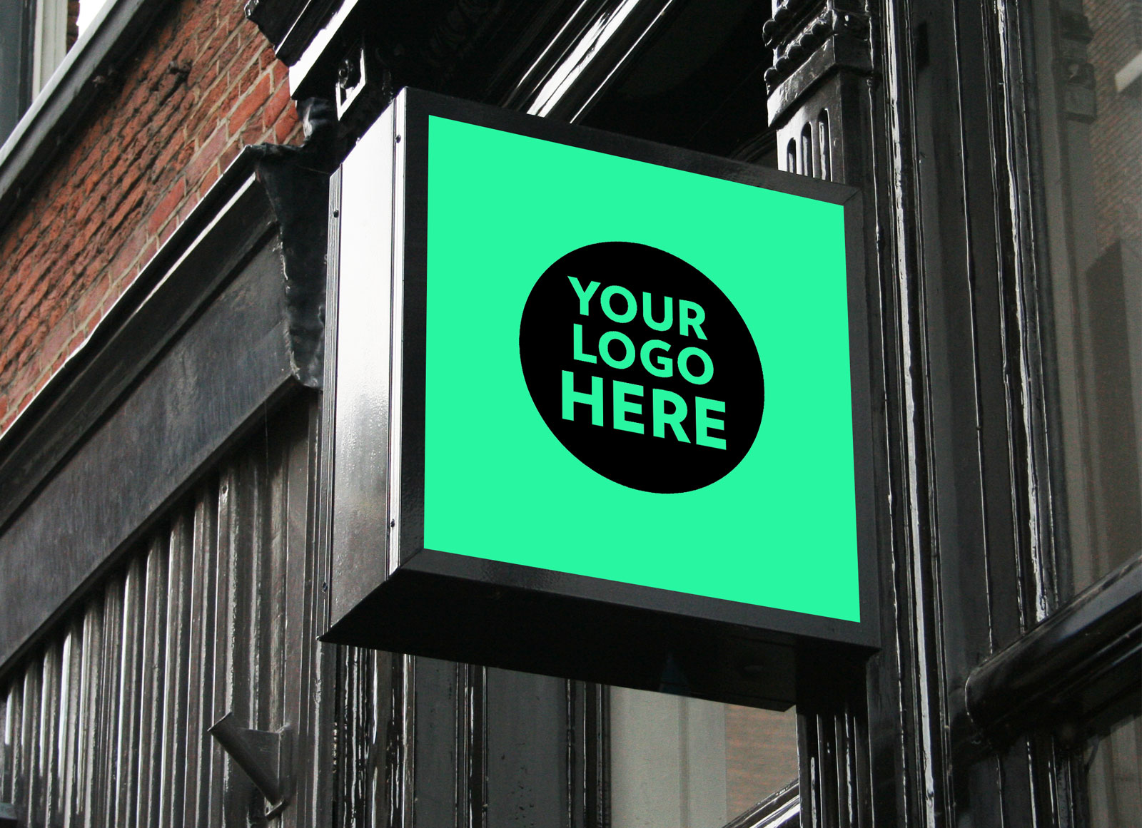
Include Logo Prominently
Your brand logo should be visible and instantly recognizable. A well-placed logo reinforces brand identity and enhances memorability.
Optimize Layout and Composition
The arrangement of elements on a signage board impacts both aesthetics and functionality. A well-structured layout ensures the viewer’s eye naturally flows from one piece of information to the next.
Balance and Alignment
Aligning text and images creates a sense of order and professionalism. Symmetrical or well-balanced asymmetrical layouts are visually appealing and prevent the design from appearing chaotic.
Hierarchy of Information
Prioritize essential information using size, boldness, or positioning. The business name or primary message should stand out the most, followed by secondary details like contact information or promotions.
Negative Space Usage
Incorporating sufficient negative space around text and visuals improves readability and draws attention to key elements. Overcrowding can overwhelm viewers and reduce the sign’s effectiveness.
Focus on Durability and Material Selection
A signage board is not just a visual asset; it must withstand environmental factors and maintain its appearance over time. Selecting the right materials ensures longevity and reduces maintenance costs.
Material Choices for Outdoor and Indoor Use
-
Acrylic: Offers a sleek finish for indoor or semi-outdoor signs.
-
Aluminum: Lightweight, rust-resistant, and suitable for outdoor signage.
-
PVC or Foam Boards: Cost-effective options for temporary or indoor signs.
-
Metal with Powder Coating: Provides durability and weather resistance.
Consider Weather Resistance
Outdoor signs must endure rain, wind, sunlight, and temperature fluctuations. UV-resistant inks, laminated finishes, and weatherproof materials extend the life of your signage.
Maintenance and Cleanability
Choose materials that are easy to clean and maintain. A sign that looks fresh and professional over time builds trust and leaves a positive impression on potential customers.

Integrate Lighting and Visibility Enhancements
Lighting can dramatically improve the impact of a signage board, particularly in low-light or nighttime conditions. Proper illumination ensures visibility and reinforces brand presence around the clock.
Types of Signage Lighting
-
Backlit Signs: Light shines from behind the sign for a glowing effect.
-
Edge-Lit Signs: LED lights along the edges highlight text or shapes.
-
Spotlights: External lighting enhances visibility without altering the sign itself.
Strategic Placement
The position and angle of lighting should reduce glare and prevent shadows from obscuring important details. For illuminated signs, ensure that the brightness is sufficient but not overwhelming.
Energy-Efficient Options
LED lighting is preferred for its energy efficiency, long lifespan, and vibrant illumination. Choosing sustainable lighting solutions aligns with environmental responsibility and reduces operational costs.
Ensure Compliance and Accessibility
Functional signage goes beyond aesthetics; it must comply with local regulations and accessibility standards to serve all audiences effectively.
Regulatory Requirements
Many regions have specific guidelines for sign size, placement, and illumination. Adhering to these regulations avoids fines and ensures public safety.
Accessibility Considerations
Signs should be readable and understandable for people with disabilities. This includes proper font size, braille options where required, and color combinations suitable for color-blind individuals.
Clear Directional Signage
For functional purposes, signage should guide customers efficiently. Clear arrows, maps, or step-by-step instructions improve navigation within commercial spaces.
Conclusion
Designing a signage board that is both attractive and functional requires careful attention to multiple elements, including typography, color, visuals, layout, materials, lighting, and compliance. By following these seven proven techniques, businesses can create signs that not only capture attention but also communicate their message effectively, enhance brand identity, and provide a seamless experience for their audience.
Investing time and resources into high-quality signage is a strategic decision that pays off in increased visibility, customer engagement, and long-term brand recognition. In a competitive market, an effective signage board can be the difference between being noticed and being overlooked.
By prioritizing readability, incorporating strategic colors and visuals, optimizing layout, choosing durable materials, integrating lighting, and ensuring accessibility, your signage board can achieve maximum impact, turning every passerby into a potential customer.